
RBC Heritage
Website & Email Redesign | Art Director, Dixon Schwabl
The Challenge
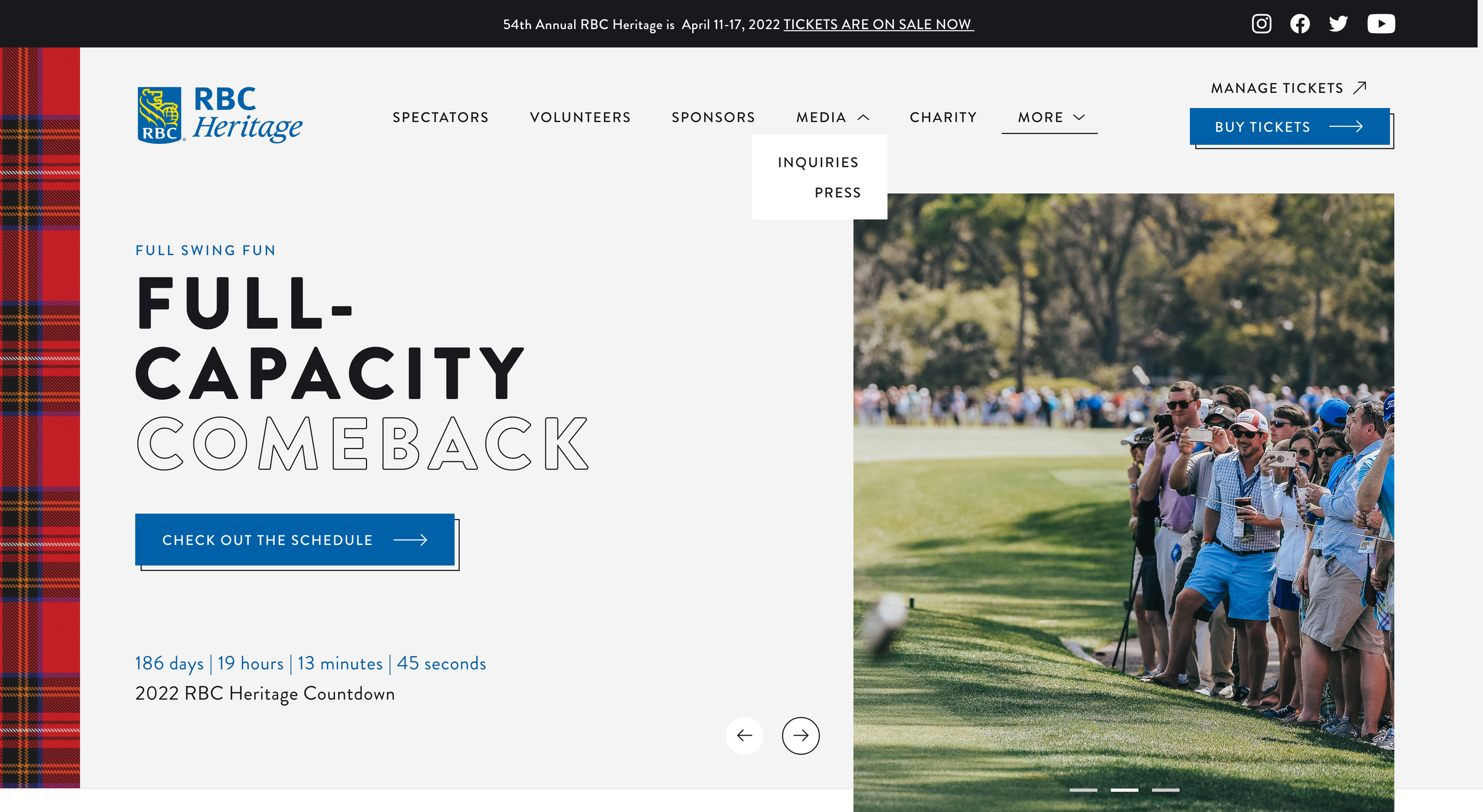
RBC Heritage’s website and marketing emails hadn’t kept pace with the brand’s evolving campaign work. The site felt dated next to the tournament’s updated visual identity, and the email templates were rigid, making it hard for the marketing team to update content efficiently during the fast pace of tournament season.
The Solution
We rebuilt both the website and email system around modularity, giving the client more control with less day-to-day reliance on outside support. The new site brought the tournament’s visual identity into a modern, flexible framework, while the new email template let the team mix and match components on the fly for tournament marketing sends.
My Role
I worked closely with developers and creative director to redesign the RBC Heritage website, building a modular system the client could update independently. I also partnered with developers to build a new Mailchimp email template, giving the team flexible, component-level control over tournament marketing emails without needing a developer for every send.
Channels
Website
Email
Frontier Enterprise Site
Website & Design System | Digital Designer, Dixon Schwabl
The Challenge
Frontier needed a better way to navigate and organize their website, one that would make it easier for users to find what they needed without friction.
The Solution
Our team developed a new design system built to better communicate with Frontier’s audience and support smooth, intuitive navigation across the site. We documented the system in a style guide and built it out in Zeplin, creating an easy, organized handoff for Frontier’s in-house team of art directors and developers.
Ferona Restaurant Website
Website Redesign | Freelance Art Director
The Challenge
Ferona’s previous website hadn’t been built with its audience in mind. As a restaurant that had only opened in 2018, Ferona needed a site that could speak to both loyal, casual regulars and new customers discovering them for the first time.
The Solution
I worked closely with my client to identify who we were really speaking to, then used that insight, paired with what was most profitable for the business, to shape the layout and structure of each page. Rather than leaning on heavy copy, I kept the text short and let photography carry the story, showcasing both the space and the food coming out of the kitchen to give visitors a real sense of what makes Ferona worth visiting.
Prime Care Website
Website Redesign | Digital Designer, Dixon Schwabl
The Challenge
Prime Care needed a facelift to stay competitive in their market, a site that was more usable for clients, bolder and more modern in feel, and fully compliant with Double-A accessibility standards.
The Solution
We reworked the site’s UI and redesigned four key pages, building out template options the client could apply across the rest of the site. The new design leaned into bolder, more modern visuals and made greater use of Prime Care’s own photography. We also added more links from the homepage for easier navigation and built an editable testimonial section with large color callouts to make client feedback more visible and engaging.
Web Animations and Illustrations
I also created animations and emails for both Carestream’s “The Stream” newsletter and The Verdi Group.
For The Verdi Group email, we wanted a Christmas/winter vibe that also called back to the Beaujolais Party the previous month. After watching Bob interact with clients and friends at the party, I suggested a toast-themed concept and created a looping animation to bring it to life.
The Carestream Newsletter was a bit different. I had illustrated the DRX-Revolution machine for a previous issue, and the team liked it enough to suggest reusing it, this time inside a snow globe, alongside illustrations of the rest of the DRX line. I animated the falling snow along with the DRX-Revolution and the DRX-Nano machines within the globe.